Friday, 4 December 2009

Audience

The target audience for our magazine and our film product is young adult and teenagers.
Through our research, Rom-com's are mostly targeted at this age.
The type of wording we use is targeted at that specific audience.
It is a type of informal writing and an informal script which would relate to the type of language that our audience normally are in to.
Having bright colours and an inventive scheme for our magazine cover, poster will attract these audiences in to watching the film.

Poster

Through discussion we, decided that we will create a billboard poster. Something different to the average poster displayed in magazines and in the cinema. We have come up with a theme, of the main character having a split face. One side will be the dressed up side and the other will be his true self.

Tuesday, 13 October 2009

Location Shots.

We will need to experiment taking photos in different places to see what kind of codes, conventions and effects we are giving off in the film, for example we cannot go to the Epping Forest where it is giving off dark lighting and a form of fear because we are creating a comedy trailer, so we need to find locations suitable to the genre, codes and conventions that are going to
be used.


Click Images To Enlarge.
I went around Chigwell and took some suitable location shots, that could possible used in out trailer.
This is a suitable place because we will be using a shopping scene in the trailer and this road is filled with shops, which will go along with the scene.
Also, It is not very busy which will make filming easier for us.


Using the inside house in our work, will establish the beginning of our video and most likely the end.


I took a picture of the Bus Stop, A discussion could take place here.


A form of transport that could be displayed for a gathering that could show be shown in the trailer.


A clear area that could be used for our filming.


Filming inside the school could occur and be displayed in our trailer.


A clear area for filming, There is also a park which can be used.


Monday, 12 October 2009

Experimenting. ~ Photos

I will be experimenting with some photos, using different contrasts, colours, angles and changing the image to make it have impact, editing and removing backgrounds.
These are a few samples of what I have been doing.

Original Photo;


Original Photo;


For the two photos below, I used a program called Photoshop Elements.


Original Photo;

Sunday, 4 October 2009

Title Samples. - Magazine Cover

For the creation of our magazine we would also need a title name, Through looking at the questionnaire we would soon come up with a name that can be applied to the magazine.

For now I will create a few samples titles that could possible used.

Sample 1;
A theme of white,red and green are used, these colours go well together.
They are aligned horizontally, displaying the colours fairly.


Sample 2;
Different font is used in this sample of the 'film weekly' title.
Red, green and yellow are used.


Sample 3;


Stylish writing is used along with the colours of black, red & yellow.


In an end result, we ended up coming with a different design.
Through our analysis of magazine covers, we noticed that the magazine names were also bold and often one colour.
This is our end result of what we will be using.
Click to enlarge image.

Thursday, 1 October 2009

Construction of our Front Cover.

In class we discussed the way our ideas of how our Front Cover for our magazine should look.
This is the Draft drawing I had produced in class.
I will Adjust this in to a Word Document layout in the next step to get a better chance of what I may have to remove or include.
and what improvements could be made around this front cover.
Click Image To Enlarge.


I have created a boxed version of the layout shown above, This print screen of it is a basic layout showing the places where mastheads, Titles, captions etc are most likely to be placed at.
Click Image To Enlarge.


I have added images and have improved our draft, this gives us a clearer idea of how our front cover should look.

Click Image To Enlarge.


Since my last update of our magazine cover, I have changed it dramatically.
I have enforced different criteria.
Changed the colour scheme.
There were many faults when constructing such as the theme colouring.
It was pretty much all over the place.
This new print screen is close to our final piece.
Just a few touches are needed and a bit more editing.
The colour scheme is clear.
We have made it vibrant and bright which makes it bounce of the shelf to any audience and customers.

Click Image To Enlarge.


After much debate, I decided to remove the bottom left image.
The removed the audience's attention to it, because it seemed so significant when it only related.
The attention is supposed to be in the centre of the page, where the main image is and the main article is.
This is my new print screen of the main magazine.

Click Image To Enlarge.


After much discussion with our teacher and amongst ourselves we decided that we will add green to our final product.
It is now complete. : )

Click To Enlarge Image.

Wednesday, 30 September 2009

Website Magazine Research ~

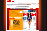
In this section, I will be print screen evidence of production of the magazines that I have anaylsed and researched. Through looking at their websites I have noted that they are forwarding a lot of items that will bring them business. E.g. On total film magazine, i saw a section of the website where they had shown previews of the magazine. I will print screen them as evidence to show they are producing the magazine and sampling them on their website, This shows they are giving samples to get customers to buy the real thing. Which is a clever marketing technique.
Even though I am not creating a website, It would be best to research ways that they market themselves and the production and looks of double page spreads that they sample.

> Total Film <
(Click 'Total Film' to reach their website.)
Below is a print screen of their magazine online and a double page spread, which has an interview with the director of the upcoming film 'The Hobbit'.
Above the double page spread sample you can see the system that allows you to flick pages.
Click Image To Enlarge.


Below is a print screen of their magazine cover that they have advertised on their website in the same way as I have displayed above with the double page spread. Like Empire (below),
They have also given a sample of their front cover.
Click Image To Enlarge
.


________________________________________

> Empire <
(Click 'Empire' to reach their website.)
Below is a sample of the front cover, and that is all that was available, This technique is almost the opposite of Total Films. Empire give little away as much as possible. and alongside their previews of the magazine cover, they offer a subscription, they have obviously seen this as a marketing opportunity.
Click Image To Enlarge.