.: Magazine Cover Analysis :.
1. My First Magazine Cover Analysis is in my scrapbook.

2. Here is the Second Magazine Cover I have analysed.
Rap-Up is a magazine that was launched in the year 2001, the founder is Devin Lazerine. The publication of this magazine was originally to be a website that was devoted to Hip-Hop, until lazerine had pitched the possibility of a magazine to a few publishers. The Magazine is focused on the Hip-Hop aspect of the music industry. Rap-Up is issued quarterly and the magazine’s target audience is 14 – 28 year olds.
This magazine limits itself with few details and exaggerations most magazine covers have. The magazine’s name is Big, Bold and black, which goes well with the silvery coloured background. The U is cleverly blended with an arrow that is facing up hence the word ‘’UP’’. The three music artists on the front are made to look similar but clearly are very different with their type of clothing and positioning, this is perhaps used to make the audience think. The masthead ‘’STOP & STARE’’ is making you do exactly that, it is then clever leading on to introducing the name of the artist on the front cover. All three artists have text coloured black but with different coloured backgrounds for their names. Perhaps the black is used to resemble to similarities e.g. all are in the music industry and the background colouring is used to resemble the different people that they are. The magazine is clear about what issue it is, ‘’SUMMER’’ being in pink showing what term this magazine was released, and the year below in black. At the Top above the magazine’s name and in the right hand corner there are numerous artists’ names which will tell the audience that these people are included inside the magazine. The three artists at the front dominate the magazine, and their positioning is very similar e.g. the hand positioning facing forward. The magazine lacks any pricing, barcode or website on the front of the magazine; this is quite peculiar because most magazines have them. The magazine has vibrant colours which are moulded with black, quite an unusual theme.

3. Here is the Third Magazine Cover I have analysed.
Vibe is a magazine that was launched in the year 1993, by founder Quincy Jones. The publication of this magazine is focused on R&B and hip hop culture. The magazine is issued monthly. The magazine’s target audience is dominantly young, urban followers of hip-hop culture
This magazine is dominantly coated with the text colours of blue and yellow. The magazine’s name is bold and bright with yellow text, but part of the magazine name is covered by the artist who is modelling and dominating most of the front page. Clearly, the magazine does not need to establish its name because it is a very popular with its target audience and the covering of the name may be used to emphasis the artist. Because yellow is such a vibrant colour it is used on the key words ‘’Ciara’’ (the artist on the magazine) and ‘’Hot like me?’’, this phrase may have been used to exaggerate the ‘’sex appeal’’ of the artist. The name Ciara is also the masthead. In the right hand corner there is a list in yellow, red, green and white used to display the numerous contents inside the magazine. In the left hand corner, there is a barcode with the website, but there is no price tag, perhaps this is done to tell the audience that the price has not changed from last time, but this may have some form of impact on new customers. Also in the left hand corner there is a few list of names to show that they are also included in the magazine. Also under the magazine name there is a circle claiming that there are ways to win a trip to Miami, this may also attract new customers and regulars.
.: Contents Page Analysis :.
1. My First Contents Page Analysis is in my scrapbook.
2. Here is the Second Contents Page I have analysed.
This contents page is limited with 4 colours, Gold, Black, Red and white. The Gold is used entirely on the magazine’s name – ‘’ICONS’’ Perhaps this is trying to establish the importance of the word and the magazine, because Gold is a highly favoured colour often associated with Wealth and Fame. Red is used alongside black most of the time on this contents page, most probably because the colour blends very well with one another. The numbers are coloured red and alongside the contents of what is in each page which is in black. The Title of the page is not very dominant, but it is clear that this is a contents page. The word Contents is cleverly translated in to the words ‘’Departments’’ Showing how different this magazine is. The term ‘’Departments’’ is often used in clothing shops. So therefore the title ‘’Departments’’ further implies the associated of the magazine to ‘’fashion and Lifestyle’’ and the contents of the magazine. The words ‘‘Premiere Issue’’ also implies that this issue of the magazine is important. White text is used at the top with a thick black bar behind to support the colouring of the white text. The text ‘’CLASSIC HOLLYWOOD STARS & LIFESTYLES’’ also shows what the contents of the magazine is. The model on the right hand side of this contents page seems to be very fashionable, with also white and black clothing to go along with the theme of the page. Her positioning works very well with the page, because they have been able to use clever ideas such as under her arm which is holding the umbrella. ‘’WHO’S YOUR INFLUENCE?’’ with the number page on it. Clearly the woman may be some sort of influence upon people, and the magazine questions the readers.
2. Here is the Second Contents Page I have analysed.
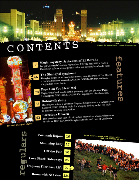
This contents page is very interesting with many different features that a regular magazine would not normally have. There is a picture of Barcelona at the very top of the magazine dominating at least 1/5 of the page. While underneath there is a clear title written ‘’CONTENTS’’ in white. The magazine has a very special and unique way of informing their audience of the material that is inside the magazine. On the 1st half there is ‘’Features’’ which displays new items that are in this particular issue of the magazine. The word ‘’Features’’ is vertical on the right side of the page. This seems like a very inventive idea. Another clever scheme that the magazine has used in the contents is the way of informing people about the number of the pages. The numbers of particular pages are in cooperated in to coloured boxes, Orange boxes being associated with ‘’Features’’ and Yellow boxes being associated with ‘’Regulars’’. On the ‘’Features’’ Section’’ there is number 66 in a orange box but this time with an arrow pointing to the picture in the middle left-side of the page, which is a picture of Shangai’s lights, and the same is applied to regulars number 29, which is in a yellow box this time which connects to ‘’Regulars’’ and is pointing to a picture on the right of people running down hills. Both ‘’Features’’ and ‘’Regulars’’ are vertical alongside the contents of what the magazine’s has. Features are used at the top middle of the page to inform the audience of what is new to the magazine and regulars is used to inform the audience of what is still in the magazine. The most logically reason to have regular items in the magazine is because it is most probably those major items that are attracting their target audience to the magazine. The black background is most probably used to have the foreground have as much impact as possible with the clever colour scheme and the slant of the words and pictures.
.: Double-Page Analysis :.

The double pages theme is limited to only three colours; Red, White and Black. This Double-Page is also revolving around a Questionnaire, Often Double pages do, because there is a lot information to be inputted and that’s why it would be easier to incorporate it in to a double page (Spread). The Questionnaire revolves around only two colours Red and Black. Red being the questions and being used in a quote in the middle of the double page. Black is associated with the answers. This way of in co operating the colours with questions and answers is very popular but it is also an easier way for the audience to understand what is occurring. The artist picture is in the middle of the photo, which implies that the questionnaire around the photo is about them. On the left hand side it has a clear title of the band’s name, which is bold in white with capital writing. Above is another picture of the group, with a ‘’skull’’ probably something that is associated with their music or the genre of music e.g. Emo. Below the name of the band are pictures of the insides of watches showing all the mechanisms. This picture is used because it may be an icon that applies to their name or image e.g. ‘’Hours’’ and in the left hand corner, it has a short introduction and prologue of the band which is in white, because the background on the left hand side is black. White is the most vibrant colour when next to white and this is most probably why the text colour was used.

3. Here is the third double-page I have analysed
The title of the page is boldly across the top with the band’s name in the title, ‘’DIE SO FLUID’’. The picture in the centre left of the double page is very wide and stands out more than the writing. It’s clear that the whole double –page is all about them. The pages are also black and white, perhaps the band’s theme and it is therefore in co-operated in to the magazine to apply to the band. The pages are very firm with the theme. The clothing, Style, Fashion and instruments are used to imply the genre of music that this band performs. The writing in the right hand corner is very detailed, only in black. With every new subject it is introduced with a sub-heading that is bold and has a text colour of black. In the centre of the right hand page, there is a text box with a picture of a man, who is associated with the band, the text box and confined space shows that this is something important and worth reading if you are interested. And the information inside the text box must apply to the man that is along-side it.
QUESTIONNAIRE RESULTS
I distributed a questionnaire with basic questions and answers to get a simple idea about the purchasing, price, interests in what people have in magazines. I had seven questions with numerous answers which would apply to most people. Below are the results of the questionnaire. The questionnaire was distributed to both genders unevenly, in the age group of 16/17. The numerous questions which were asked were basic, and most questions were multi-optional. I have created Pie charts to adapt to the questions; this will make the results easier to understand.
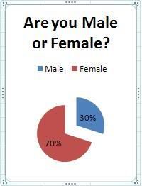 I had distrubuted the questionaires unevenly, therefore making results varied.
[Please click the pie chart for full graph]
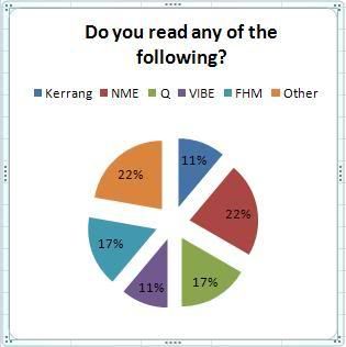
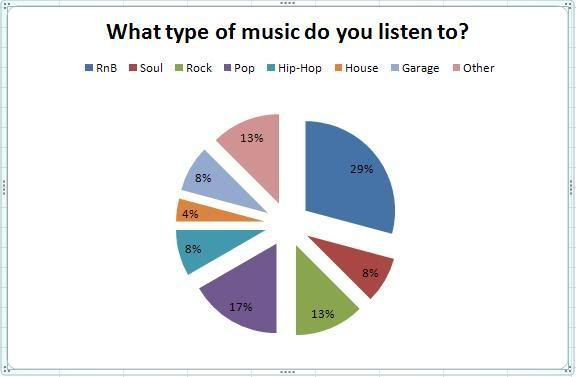 This question was asked to get a better understanding of what type of music is popular and what is not among the age group of 16-17, and to know what type of music should dominate my magazine.The graph displays that RnB & Pop are the most popular form of music within this age group.
[Please click the pie chart for full graph]
4.
[Please click the pie chart for full graph]
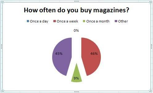
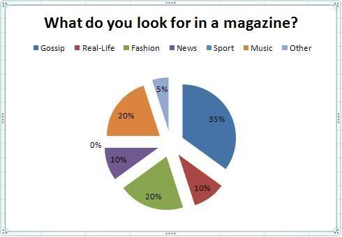 To know what the audience look for in a magazine is the key area for my magazine. By understanding what is popular and what's not. The most popular material would dominate the magazine, and the least would have less off an appeal on my magazine.
5.
6.
7.
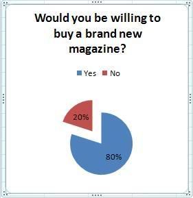 This question is very important to see if the target audience are looking for something new that appeals to them.
Well done Ali, you are working along the right lines. Are your pages meant to be included in the blog or are you including a scrapbook for those? Would be good to summarise what your overall findings were from the questionnaire and what you might use to shape your own work.
ReplyDeletetry to be more specific and use appropriate terminology in your analysis - these are rather general.